
Branding
Powder Paint
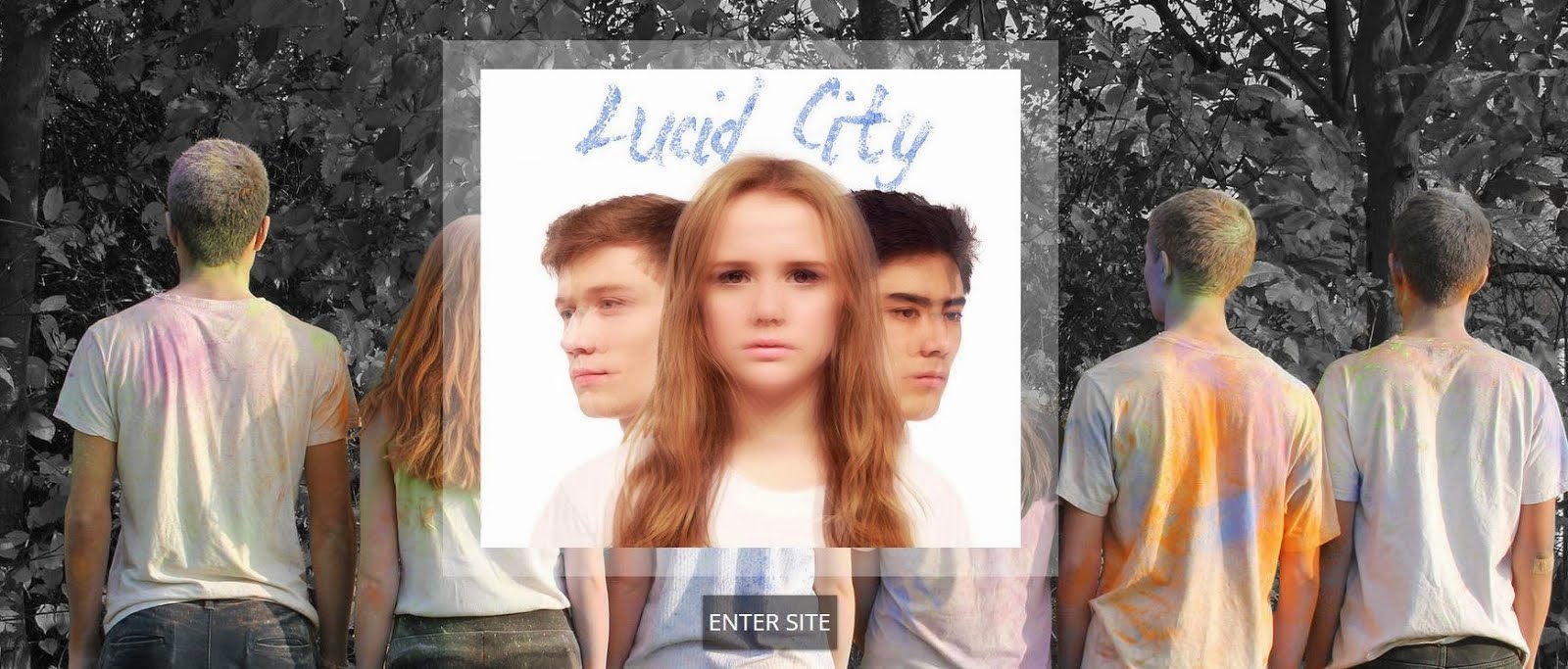
 Whilst on set of one of the powder paint shoots we took some pictures that we thought we might need to use at a later date, on our website or perhaps on our album cover. In the research and planning stage of the project we decided that we wanted to take a photo of the group of friends from behind, whilst they were covered in powder paint. This was inspired by the back cover of an MGMT album called Oracular Spectacular. Although our ideas for the album art changed during the process, we thought this image that we had taken was really strong so we decided to use it as the background image on the website's landing page. This means that it would be one of the very first images that any visitor to the website would see.

The band's logo is also made out of powder paint, and this features on the header of our website, not only on the home page, but on every other page as well, to ensure that the logo becomes a really familiar icon amongst fans of the band. We wanted the logo to look as authentic as possible, so instead of using images online we photographed some of the powder paint that we had left over from one of the shoots and edited it during photoshop to add layers of the powder paint on top of each other to make a bolder image.

 We also made a video of lots of clips of footage that we had taken on the days when we were filming the powder paint scenes; this is another thing that the audience can watch on the website, hopefully keeping them there for longer.
On the website we had a section for 'behind the scenes' pictures which had a large selection of pictures to look at, many of which featured powder paint, further maintaining the powder paint theme through the website.
Our powder paint logo is also present in our icon on our Soundcloud account which will be seen by those who choose to listen to our music via Soundcloud rather than on other online sites such as YouTube. As Soundcloud is used a lot by fans of the dance genre, we thought it was important to create an account to target our primary audience; it is a website which is focused on the music and so it doesn't have many visuals, this is why it was so important to have our bold logo as our icon to keep up the synergy.

The powder paint logo is also the main feature to our artist's merchandise, on clothing such as our women's baseball shirt and on accessories such as an iPhone 5 case.


Another dance artist who now has a very recognisable logo is Disclosure; they use the same stylised image of the outline of a face throughout their different products. They use in their music videos, album covers, promo shots, on merchandise, and all throughout their campaigns - they even projected it onto buildings across the world, including London's very own Big Ben.
Clean Bandit are a real dance music artist that shares lots of similarities with our own artist; they are young, fairly new, British, they have both male and female members, and art of the same genre as our artist Lucid City. I did a small case study on their marketing campaign whilst we were creating our own, I focused on the synergistic aspect of their campaign. The mind map below explores some of they key things I discovered while looking across some of their different campaigns.
Festival Iconography
As well as using powder paint, we wanted to create a festival-like feel to our artist's products, making their brand fun and youthful in order to appeal to our target audiences. We created a competition page on the website which asked fans to send in their best festival photos for a chance to win festival tickets to see Lucid City in the summer of 2015. We included a 'latest entries' slideshow feature to the page; we included lots of my own photos from a festival I attended last summer to further portray this festival vibe.
 |
| The competition page on our website. |
We included a section on the 'news' page of our website which provided the fan with a link to the competition page, we also encouraged fans to enter the competition by sending us their photos via our Twitter page, creating synergy between our official website and our social media sites.
 |
| Competition news. |
Like many other real dance music artists, we wanted ours to perform at festivals in the UK and abroad. Festival culture is so important to our target audiences of 16-24 year olds, and is often the focal point of their summer. Lots of people in this demographic will have fond memories from music festivals and will be keen to attend more. On our website we include news on which festivals Lucid City will be performing at; we specifically chose festivals that often feature dance music artists.
 |
| Lovebox festival. |
 |
| Wireless festival. |
 We wanted to maintain this festival vibe throughout our music video, to do this we created a fun atmosphere with the powder paint and the balloons. We asked all of our extras to where festival-like clothes; items such as tie-dye tops, trainers, patterned shirts, and bandanas.
 We knew that it was important to not only maintain synergy across our campaign, but also to create symbiosis between other institutions. The board below highlights the different ways in which we have created symbiotic relationships with institutions such as clubs and radio stations.
Blurring Effects

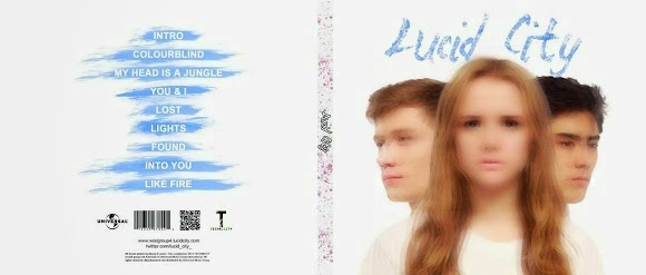
We used 'blurring' effects across our main product and our ancillary products. On the front cover of our album we used photoshop to lay several layers of the same image on top of each other to create a blurred effect. I think this looks really effective as album art as it is simple but not basic. We used this blurred effect in our music video as well; we wanted to use an interesting effect when Namoi transitioned into the paint fight scene.
We used social media as our main method of marketing our products; we thought that this would be the most effective way of reaching our primary and secondary target audiences of 16-24 year olds. The graph below shows just how popular Twitter is amongst 15-25 year olds, 75% of Twitter users, of which there are millions, are from that age demographic.
 |
| A graph showing the age distribution on Twitter. |
On our Twitter page we wrote tweets that shared our music video, the 'retweet' feature on Twitter allows people from all different demographics, not just our target audience, to see our music video on their Twitter timeline. By watching the music video hopefully people will be encouraged to buy the album, or go onto the artist's website to learn more about Lucid City.

According to Richard Dyer's star theory, it is vital for the fans to believe that the artist's identity is authentic in order for the audience to connect with the artist which will encourage them to buy the product which will in turn, maximise the profits they make.

We used our Facebook page in a similar way to the Twitter page; on both pages we used the album cover as our profile picture to create synergy between the different platforms, it also reinforces the imagery and makes the consumer more familiar with the album cover, making them more inclined to purchase it. Our Facebook page also contains links to the website and our other social media sites.
We used our website to tie all the texts together, one of the main functions of the website was to sell the music - Lucid City's debut album. The album cover was featured a lot on our website, we provided many different purchasing opportunities for the consumer on the website. Not only could the site visitor purchase a physical copy of the album in a CD format and vinyl format, but they could also download digital copies of the album through iTunes. The collage above is made up from pictures of all of the different ways in which the album could be bought on the website.
Overall, I think that we created a strong brand across our main product and both of our ancillary texts, we used synergistic links between the different artefacts to maintain a consistent brand image for Lucid City. We also chose marketing strategies that would be best suited to reaching our target audiences, which helped us to create an effective marketing campaign.
No comments:
Post a Comment